Touchscreens are a genuine Big Deal, but it’s hard to appreciate how big. As we’ll see below, touchscreens break two core assumptions underneath how we’ve designed graphical user interfaces to date. I think we’ve only seen the start of it.  The mental model we use to design programs assumes a “pointer” that has a definite position but occupies no space. The graphic casually called a pointer is just a marker of where this abstract pointer is at any given time. It’s a pointer to a pointer, as it were. The pointer moves along a continuous path on the X,Y plane in response to the user manipulating some device in real space. In other words, Etch-A-Sketch. Fitts’s Law (and more generally, Steering Law) has strongly influenced UI design. It states, more or less, that bigger targets are easier to hit. The cool thing is that it tells you exactly how much easier and what error rate you can expect for a given size and distance. It’s one reason why high-value click targets like menu bars are placed at the edges of the screen: it gives them effectively infinite size because the edge stops the pointer for you. It also explains why deep hierarchical menus suck: the longer the path you have to steer the pointer through, the more likely it is you’ll make a mistake.
  Computers went through a twenty-year period when displays became larger and denser while pointing technology become more accurate, but didn’t change the basic model. We could present more information at once; toolbars grew and sprouted palettes and ribbons and submenus. The presentation of content on screen became more and more faithful to the final output, under the rubric “what you see is what you get”. Programmers came to assume that all of these trends would continue, and produced a host of guidelines founded on the little dot that follows an unbroken path:
- Don’t make the user navigate paths that are too long, narrow, or complicated.
- Don’t place common actions too far away from each other.
- “Content” goes in the center with menus, buttons, and toolbars arrayed around it.
- If you have more space, fill it with tools. If they can’t see it they won’t use it.
- If it’s often used, put it near the edge of the screen.
- Keep the locations of things stable.
- Corners are ultra-prime locations.
- …etc, etc, and so forth
WYSIWYT
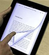 Then cell phones mutated into real pocket computers. So far so good; we can dig into history and new research on how to deal with small screens. It’s going to be a pain trying to fit all the information people now expect into a smaller area, but it’s possible. But, these small screens are also touchable. The union of what you see and what you touch breaks the pointer model and (partially) Steering Law: the “pointer” is no longer a point and its travel no longer continuous. After fifty years of Etch-A-Sketch we get to play with fingerpaint. All of the implications are not yet obvious, but here are six or seven: Steering Law doesn’t apply as strictly when the user can tap one point and then another without having to steer through a predetermined path in between. This is demonstrated by the new generation of iPad apps that use pop-out menus in ways that wouldn’t work as well on a mouse-based system. The cost of a menu has gone down while the cost of screen real estate has gone up, producing a different solution. Make touch areas more obvious, not less. The user has neither real tactile feedback nor a “hover” state to indicate that something will happen when he taps a particular place. Jacob Nielsen observes that iPad developers are currently partying like it’s 1993, throwing all sorts of weird conventions into their apps while imitating print. Resist the temptation. A hallmark of new technology seems to be how it initially imitates or rejects its predecessors, then simulates them, and finally absorbs them. At the moment I’d say we’re in between stage 1 and stage 2 with touchscreen interfaces. When you first get your hands on an e-reader with near-print resolution and “pages” you can flip with your fingers, it certainly feels like an apotheosis. Hey, you think, this is an acceptable simulation of a book. The illusion frays when you encounter a newspaper app that clings to some of the more annoying conventions of paper, does bizarre things when you tap a photo, and offers no search. [0]
 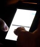 The importance of large click targets goes way up on touch interfaces because we’re using our big fat fingers instead of a geometric point. This brings up a fact we can no longer politely ignore: some fingers are fatter than others. Industrial designers know all about anthropometric variation. Anyone programming touch interfaces will have to, too — or at least some, um, rules of thumb. A controlling factor is the average adult male finger width, about 2cm. Female hands, not to mention the hands of children, average smaller. In practice, touch buttons seem to be usable for most people down to 8 or 9 mm, but not much smaller. [1] People with smaller hands are generally happier with the software keyboards on mobiles, leading some to speculate on a conspiracy of pointy-fingered elves. A friend of mine with very large hands has to hold it in his left and poke delicately at the keys with thumb and forefinger. [2] It’s possible that one interface will not be able to accommodate everyone, and why not? We have different-sized mice and chairs and playing cards. It would be interesting to see how application designers experiment with configurable button sizes as they do with font sizes. Some software keyboards make common letters like E and T larger than the rest.
  A related problem is how the finger and hand occlude other parts of the screen during interactions. Like those jerks in the front row of a movie theater, your hands get in the way at just the wrong time. Enlarging the thing being pressed is a good workaround, but what about the rest of the screen? There are quite a few first-person perspective games that overlay joystick controls on the main view. This kills peripheral vision: when turning left your hand covers most of the right side of the screen. Game developers know this, and that’s why you often find several control schemes to choose from while they test out ideas. I suspect that those kinds of controls will gradually migrate to the bottom third of the screen. More subtle changes are happening with eye focus. With a full-sized computer both eyes are focused on a single point about half a meter away. Pocket computers tend to be held closer and it’s uncomfortable to close-focus for long periods. Also, the occlusion problem is partially solved by defocusing your eyes, so parts of the screen blocked for one eye are visible to the other. It’s almost automatic. If you know a fast phone typer you can test this out by watching their eyes as they type, then blocking the screen with your finger. Their eyes will turn slightly inward as they change focus. That feels somehow wrong to me. Great touchtyping is why people love hardware keyboards. A while ago, I prototyped a Morse code “keyboard” for my mobile phone to see how it compared to software QWERTY keyboards. It sounds funny, and it is partly a joke, but it’s also the minimum thing that could possibly work. With practice you can get fairly good.
 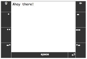 One thing the Morse experiment taught me was that Fitts’s Law didn’t go away completely. This is not exactly a new revelation, but there is always some hot zone that is easiest to hit, unique to a given device size and orientation. On a pocket computer in portrait mode the hot zone is at the bottom. In landscape mode it’s the area on either side, about two-thirds of the way up where the dit [.] and dah [-] buttons are. On a tablet the hot zone seems to be in the bottom right (or left) quadrant. Even so, the importance of the edges is less for touch than it is for mouse-based systems, because a virtual edge cannot stop your real finger. A new interaction model may also need to take into account handedness and fatigue. Within minutes of using the first version of my “keyboard” I found an annoying bias towards dits in the Morse alphabet. On a telegraph the dit is three times faster than the dah so naturally Morse code uses them more. The surprising part was how uncoordinated my left hand was and how quickly it got tired. I ended up putting three buttons on each side to balance out the work and to reduce the number of taps per character. And then you have multitouch, which knocks “mouse gestures” into a cocked hat, provided we can figure out how to use it effectively. Pinch/expand and rotate are very useful for controlling the “Z axis” perpendicular to the surface. There are also apps to simulate sound boards, pianos, and of course keyboards. Interestingly, multitouch doesn’t break any design paradigms I can think of. It replaces a lot of them like resize and rotate “handles”. Swipe can be (and is) overused but it’s a natural replacement for pagination and scrolling. Using a two-finger tap as a replacement for “right click” to bring up context menus seems to be another home run. There are probably a lot of natural places for it as a modifier signal. For example, a drawing program might allow you to paint with two fingers and control brush size by the distance between them. It’s not an unmixed blessing. Multitouch makes it harder to ignore accidental input from the palm and edges of the hand, which means the user can’t treat a touch tablet as casually as paper just yet. Touch interfaces remove one of the last physical barriers between users and digital data. Instead of manipulating data with a cartoon of a hand we control with silly instruments, we can poke it with our real fingers. This is deeply satisfying in a monkey kind of way. It gives programmers strange new problems and responsibilities. We will have to become amateur industrial designers just as we became amateur typographers, linguists, and psychologists. It puts us much closer, physically and emotionally, to the person on the other side of the glass. As users touch our programs, our programs are touching back.
Carlos Bueno, an Engineer at Facebook, is touched.
Notes
[0] Stage 3 is when the new technology stops trying too hard to simulate older technology, and instead directly addresses (or renders moot) the underlying need, using its unique advantages. Stage 3 is usually gradual. My computer still calls its background layer “the Desktop”, years after real desks as such (with drawers, pictures, clocks, inboxes, etc) distilled down to the humble table that holds my computer off the floor. Everything else has been sucked inside and transformed. [1] This kind of stuff is fascinating, if you’re the kind of person who’s fascinated by this kind of stuff: “Thai females tended to have wider and thicker fingers but narrower knuckles than the females from Hong Kong, Britain, and India.” — “Hand Anthropometry of Thai Female Industrial Workers”, by N Saengchaiya and Y Bunterngchit, Journal of KMITNB, Vol 14, No 1, Jan 2004. [2] Another friend of mine, who develops touchscreen apps for a living, tells me that finger size doesn’t matter all that much. But I notice his fingers are rather pointy and elf-like…